Finding scientific papers with a plausible premise but terrible statistics is, if not an everyday occurrence, unfortunately common. This was the basically the entire shtick of psychology papers for a couple decades - find some plausible sounding premise to write a hypothesis about, run an experiment on the first 16 undergrads you can find, and keep running regressions until you find one where p < 0.05. And then you end up with experiments whose results can’t be replicated, because their conclusions were always based on random chance. We see the same problem in papers in atmospheric science or toxicology, where flawed statistics lead to flawed results.
But what about the other type of papers? The ones where the premise seems fundamentally wrong, but everything about the experiment and the statistical analysis looks good - large sample sizes, positive and negative controls, no evidence of p-hacking. But the premise of the experiment/analysis is just fundamentally, incorrigibly wrong. Scott Alexander has written about this experience with papers on parapsychology, but I actually think that’s a bad example - parapsychology is so clearly wrong that it’s easy to dismiss the results out of hand. The most confounding papers are one the ones where the premise seems fundamentally wrong, but there’s still a nagging doubt at the back of your mind that maybe it’s true.
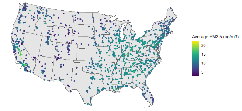
This has all been on my mind recently because of this paper: “Unwatched Pollution: The Effect of Intermittent Monitoring on Air Quality“. It’s an econ paper looking at air pollution, and it looks like a barn-burner. The idea is that EPA monitors levels of fine particle (PM2.5) pollution, but for a combination of technical and budgetary reasons, many sites only measure PM2.5 1 out of every 6 days. But we also now have satellites that can measure PM2.5 every day1, and when we compare the satellite measurements to the EPA monitoring schedule, we see that PM2.5 is systematically lower on days when the EPA monitors are running versus when they are not, suggesting that industries are gaming the system by shifting polluting activities to days when they won’t be noticed.
And yet, even though they have 800,000 data points from 13 years of data and a p-value less than 10^-4, I still don’t buy their results because the premise seems flawed: EPA monitors are used to make sure areas are following EPA rules, so what incentive is there for individuals to game the system by shifting pollution between days? Especially since PM2.5 comes from so many sources (soils, cars, power plants, trees, basically anything else you can think of) that any one factory’s behavior is going to have a pretty negligible effect on the overall pollution level.
So, ho do we reconcile this? I see three general options for what we could do:
- Bite the bullet and accept that maybe this fundamentally wrong premise is more plausible than you thought.
- Go digging through the analysis, and hope you find somewhere where the researchers did something wrong
- Chalk it all up to random chance, and say that even though their regressions found p < 0.001, these correlations are just random noise and won’t be replicated
Or to put it more simply, the options are:
- You made a mistake
- They made a mistake
- Something wildly implausible happened
Let’s take each of these in turn for this paper.
Options 1: Maybe this premise is more plausible than I thought
Again, my problem with the premise is that while it’s in the area’s interest to have pollution below the EPA limits, and it’s maybe in the polluters collective interest for pollution to be lower on air monitoring days (so they avoid the extra regulations that come with the area being above EPA limits), I don’t see what the incentives are for any individual to shift their polluting activities to a non-monitored day. I should also say that we’re not talking about small shifts here. The authors report that PM2.5 levels drop by about 1.5% on monitoring days, about the same as the drop seem on weekends. So not enormous, but more than can be explained by any individual source.
To its credit, the paper seems to know this. Their proposal for how to square this circle is something along the lines of:
- For some polluters, the cost of lowering pollution on specific days is quite low, because they are often running below capacity.
- For polluters, there is a collective benefit for pollution to be lower on air monitoring days, because there will be addition regulations and associated costs if the county becomes out of compliance with EPA limits.
- State and local governments have tools to coordinate action among polluters, including “Strategic Action Days”.
- This one isn’t mentioned in the paper, but there’s some individual benefits to polluters who cooperate with the regulators, in the sense that having a good relationship with your regulator is generally useful.
That’s not totally implausible, but I still have trouble accepting it. The key point seems to be point #1, that for some industries, the cost of shifting pollution between days is surprisingly low. That’s very definitely not true for the industries I’m most familiar with, such as power plants and oil refineries. But, according to this paper, it is true for some other industries, such as mining or wood product manufacturing. On the other hand, those two industries seem to account for about 3% of PM2.5 emissions in the US. Once you account for particles formed in the atmosphere through chemical reactions and for the particles that were emitted or formed on previous days, it becomes clear that even if all mines and wood factories shut down entirely every 6th day, you wouldn’t achieve the 1.5% drop in PM2.5 concentrations reported in the paper. So even if shifting pollution is easier than I thought, that can’t explain the results.
Option 2: The researchers made a mistake
Because this is an econ paper published in an economics journal, the underlying data is readily available. Not only that, but it has to be in a form where you can easily generate the findings from the main paper. That’s a large leap ahead of what you’d probably get if this was published in an atmospheric chemistry journal - “You can download the data yourself from NASA and the EPA. Good luck”. Say what you want about economists, but they’re only going to let a spreadsheet error destroy the world economy once.2
So we can load up their data and start poking at it. After we do some wrangling, their main result is just 1 line in R:
## lm(formula = log(satellite_pm25) ~ is_monitoring_day)
##                       coef.est coef.se
## (Intercept)           -2.245    0.001
## is_monitoring_dayTRUE -0.012    0.003
## ---
## n = 805713, k = 2
## residual sd = 1.008, R-Squared = 0.00
I get slightly different numbers than what’s reported in the paper, probably because they’re using clustered errors and I’m not, but the main takeaway is the same - that air pollution is about 1.5% lower on days when EPA monitors are running than when they aren’t. The effect is about the same whether you log-transform the PM2.5 measurements or not, and isn’t affected if you add a whole bunch of covariates. There’s no obvious thing where they forgot to control for an obvious covariate that negates the whole thing.
Where I start to have some disagreements with the researchers is in their analyses to figure out why this is happening. They report 5 results to support the interpretation that this is caused by regulators and industries gaming the system to avoid being labeled out of compliance by the EPA:
- The effect doesn’t exist for EPA monitors that measure every day or 1 out of every 3 days
- The effect goes away when 1:6 monitors at a site are replaced by a 1:3 or 1:1 monitor
- The effect is larger when the previous month’s PM2.5 readings were higher
- Strategic action days are more likely to be issued on monitoring days
- Counties with a higher gap between monitored and non-monitored days are more likely to have industries that can easily shift pollution between days.
That’s pretty dang impressive. Those all seem to really support their interpretation.
On the other hand, when I look at their data, I can find several things that don’t agree with their interpretation:
- The effect is larger at sites with a lower annual average PM2.5 (p < 0.001)
- No effect is seen on monitoring days for sites with just a 1:3 monitor (p > 0.1)
- The effect exists even in counties that have a 1:1 monitor (p < 0.05)
- The effect is stronger on weeks when no PM2.5 measurement for a monitor is reported in the EPA data (p < 0.05)
- The effect is marginally significant if you remove 2001 (p = 0.08)
…at which point I’m not sure what to think. If the authors can come up with 5 data points in favor of their result being caused by deliberate action by polluters and local regulators and I can come up with 5 data points against that, what’s the takeaway? Do their five data points outweigh my five? What if I had 10? or 50? Does it matter that none of my analyses can explain why we see such a significant difference between monitoring and non-monitoring days?
What I really think is that this approach is doomed to failure. We’re in a multiple analyses battle royale in which there can be no winner. I know I performed way more than 5 analyses while I was looking into this. I’d guess probably around 30-50 analyses, depending on how you count. I don’t know, but I’m guessing that the original researchers also did a lot more than 5 analyses while they were writing this paper. If I perform another 50 analyses, and come up with another 3 data points that contradict their interpretation, is that a point in my favor? Or is it a point against me, because only 3/50 of my analyses go against their interpretation?
So maybe let’s call it a draw, and see if these results could happen by chance.
Option 3: Maybe something random happened?
On the face of it, the idea that all of this can be explained by chance is pretty ludicrous. Our p-value is <10^-4, which (and I’m sure I’m getting this wrong, because everyone gets p-values wrong) should mean that the probability of these results happening by chance assuming the null hypothesis is true is basically nil.
But I’m pretty sure that the p-values reported by in the paper are incorrect. As an absurd contrived example, let’s ask if EPA monitoring has a larger effect in 2001 than in other years. When we do, R tells us:
##
## Call:
## lm(formula = log(satellite_pm25) ~ is_2001 + is_monitoring_day +
##     is_monitoring_day:is_2001)
##
## Residuals:
##     Min      1Q  Median      3Q     Max
## -9.5347 -0.6241  0.0690  0.6872  3.8022
##
## Coefficients:
##                                    Estimate Std. Error   t value Pr(>|t|)
## (Intercept)                       -2.240597   0.001296 -1729.332  < 2e-16 ***
## is_2001TRUE                       -0.045480   0.004197   -10.836  < 2e-16 ***
## is_monitoring_dayTRUE             -0.005374   0.003151    -1.705   0.0881 .
## is_2001TRUE:is_monitoring_dayTRUE -0.066722   0.010042    -6.644 3.05e-11 ***
## ---
## Signif. codes:  0 '***' 0.001 '**' 0.01 '*' 0.05 '.' 0.1 ' ' 1
##
## Residual standard error: 1.008 on 805709 degrees of freedom
## Multiple R-squared:  0.0003539,  Adjusted R-squared:  0.0003501
## F-statistic: 95.07 on 3 and 805709 DF,  p-value: < 2.2e-16
That’s a p-value of 10^-11 saying that EPA monitoring days in 2001 saw an extra 6% drop in PM2.5 in 2001, on top of the separate decreases we see for being a monitoring day or being 2001. But why? Is there any mechanistic explanation of why the effect of monitoring would be twice as large in 2001 versus 2002? Maybe someone cleverer than me could come up with one, but I’m almost certain that this is all random variation3. Which means that, if we trust p-values, even if we ran one analysis every second for 100 years, we wouldn’t expect to see a result this extreme from chance alone in any of them!
So what might be going on here? One option is that my estimated numbers of analyses might be way too low. This is what Andrew Gelman refers to as the “garden of forking paths”. I estimate that I did about 30 separate analyses over the course of looking at this, but because I didn’t come up with all 30 analyses in advance, the actual number of possibilities considered might be much higher. Imagine if after each analysis, there were two options for what I could look at next, and I chose which one to look into based on the result of the analysis. And, just to make things simpler, let’s say that I can always choose the option that will lead to a lower p-value. Then the actual number of analyses that I might have done isn’t 30, it’s 2^30, or basically a billion, at which point we’d have a corrected p-value of about 0.03 - unlikely, but definitely something you could get by chance.
I think 2^30 is clearly an overestimate of my multiple analysis correction factor, since in reality I can’t predict in advance which regressions will give me lower p-values. I think we can say that the effective number of analyses I did was somewhere between 30 and a billion, but I’m honestly not sure which of those two estimates is closer.
Fortunately, there’s another option. I think these p-values are just wrong, because they don’t account for correlation between data points. Linear regression assumes that your data points are completely independent of each other, but that’s not how PM2.5 works. The PM2.5 measurements on July 2 are going to be pretty closely correlated to the PM2.5 measurements on July 1, and the measurements in Seattle are going to be somewhat correlated with the measurements in Portland. The correlations are going to get even stronger if we look at the measurements in Seattle versus the measurements in Tacoma. This deep and mysterious observation, that measurements taken closer together are more likely to be correlated than measurements taken farther apart, is known as Tobler’s First Law of Geography, was invented in 1970, and (according to this website) was controversial when first proposed, in case you’re worried that you’ll never be as smart as previous generations of scientists.
Before we try to fix this issue, can we see it empirically? Indeed, yes we can. The standard way to look for spatial correlations is with a semivariogram, while the way to check for temporal correlations is with an autocorrelation function (ACF). If we plot out both of these, we see evidence for both spatial and temporal correlations, because we see the average semivariance increase gradually as two data points get further apart in space, and we see the ACF decrease gradually as two data points get further apart in time. Yes, moving up on one chart means the same thing as moving down on the other. Sorry.
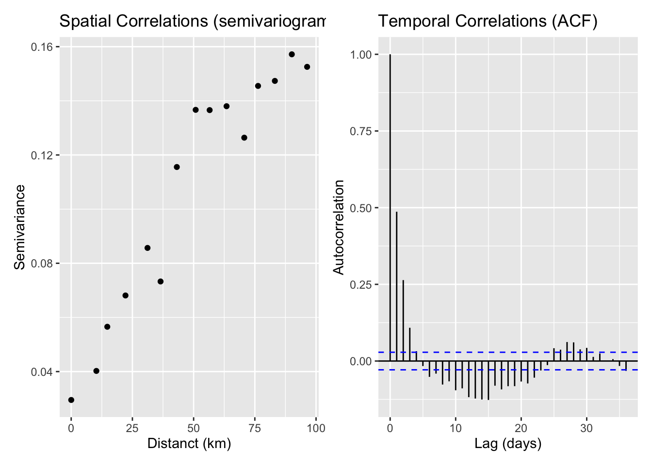
There are lots of ways of dealing with this issue, at varying levels of sophistication (see Beale et al., 2010) but a) this dataset is large enough that my laptop starts to groan if I try to apply them, and b) there’s still disagreement about which methods are best. So instead we’re going to take the easy way out and limit our analysis to only one monitor per county and only look at 1 in every 5 days. That’s probably an underestimate of the spatial correlation and an overestimate of the temporal correlation, but those are the easiest to implement.
When we do, out results are no longer statistically significant:
## # A tibble: 2 × 6
##   date_group term                  estimate std.error statistic p.value
##        <dbl> <chr>                    <dbl>     <dbl>     <dbl>   <dbl>
## 1          3 (Intercept)           -2.19      0.00371  -591.      0
## 2          3 is_monitoring_dayTRUE -0.00420   0.00914    -0.460   0.645
Except that’s a cherry picked result. If we look at all 5 sets of 1 out 5 days to choose, we get a huge range of results, including both a statistically significant decrease and a statistically significant increase in satellite PM2.5 on monitoring days:
## # A tibble: 5 × 6
##   date_group term                  estimate std.error statistic    p.value
##        <dbl> <chr>                    <dbl>     <dbl>     <dbl>      <dbl>
## 1          0 is_monitoring_dayTRUE -0.0372    0.00916    -4.06  0.0000483
## 2          1 is_monitoring_dayTRUE -0.0219    0.00928    -2.36  0.0182
## 3          2 is_monitoring_dayTRUE -0.0252    0.00903    -2.79  0.00520
## 4          3 is_monitoring_dayTRUE -0.00420   0.00914    -0.460 0.645
## 5          4 is_monitoring_dayTRUE  0.0401    0.00880     4.56  0.00000521
The huge range suggests to me that we’re still massively underestimating the errors on this coefficient. If the estimated standard errors were correct, we wouldn’t expect to see such big jumps between different samples. My guess is that the spatial correlations actually extend way past county boundaries, so our number of independent data points is still overestimated even with the restriction of one monitor per county.
A quick look at the range of estimates we got for the 5 groups suggests that we’re underestimating the standard errors by a factor of 3. If we apply that factor of 3 to the original regression, suddenly our p-values jumps from 4.8e-5 to 0.17 - from super-duper significant to not significant.
So that’s my final data point, that due to spatial correlations, the standard errors in the regression are significantly underestimated. Once you correct the standard errors, the result is not longer significant and is likely due to random chance.
Conclusions
First, what are my broad takeaways about science and statistics as a whole?
- Research degrees of freedom/forking paths is an even bigger problem than I realized.
- Rigorously accounting for spatial and temporal correlations in your data is really hard. I guess I knew this one already, but it’s good to be reminded of it.
- p-values are the devil.
- Andrew Gelman is incredibly insightful about this sort of stuff, although I’m not smart enough to get what he’s saying without thinking through all this stuff first (garden of forking paths, the difference between significant and non-significant is not significant).
- Big data is a lie? I’m honestly not sure how to think about this one. Maybe a better way of thinking about it would be something like “Traditional forms of statistical analysis are not suitable for big data”, and we need to be moving to some alternative techniques. Or maybe just that, the bigger your data set, the more you really need to think about how your errors are structured.
What about for this paper specifically? First off, I agree with the first key observation, that PM2.5 is lower on monitoring days than on non-monitoring days. The question is how to interpret this - does this represent a concerted (possibly even conspiratorial) effort on the part of industries and local air regulators to subvert federal regulations? Or is this a bunch of noise that only seems important because the dataset looks larger than it actually is?
The more I look into it, the more I’m convinced that it’s all noise. I think the observation that PM2.5 is lower on monitoring days can be explained by random chance, once you account for the spatial correlation of the measurements. As for all the supporting analyses that the authors gave, I think those can be explained by multiple analyses/research degrees of freedom. This is actually also helped by the correlations between data points, since that makes it easier to find statistically significant results that don’t actually mean anything.
If you asked me to put probabilities onto this, I’d say:
- 95%: The lower satellite measurements of particles on monitoring days is caused by random chance
- 5%: There really is shifting of pollution away from days when monitors are running
If I don’t find this paper convincing, what would convince me that pollution really is lower on days when the monitors are running? On the stats side, I’d like to see an analysis that really dug into the spatial correlation structure and included that structure in their model.
Honestly though, what I would find far more convincing that any statistical analysis is good old fashioned journalism. If air quality regulators are really coordinating with polluters to skirt federal pollution laws, maybe people talked to each other about it? And maybe one of those people wants to talk to a reporter? Even if there’s no coordination between industry and regulators, it probably takes more than one person to call a strategic action day. Did those people talk about it? Did they feel pressured to issue those calls on EPA monitoring days? This seems like the sort of thing that someone would get upset about! If this really is happening, we should be able to find someone who’s willing to talk about it.
Finally, was this exercise worth it? I just spent hours figuring out that the paper with a crazy result was wrong. I should have been able to guess that without looking into it. I’d still argue that this was worthwhile, for two reasons. First, and I know this is a cliche, but I learned a lot figuring out exactly why this paper was wrong. Several ideas that I’d heard of but had never really understood suddenly clicked only I had a concrete example that I was motivated to dig into. And second, sometimes the paper with the crazy premise is right. I’m sure for many people, this paper showing that the 5-HTTLPR gene isn’t associated with depression seemed absurd at first glance, even though most people now seem convinced that it’s correct. And if you can’t figure out why the crazy papers are wrong, you won’t be convinced by the rare ones that are actually right.
Technically the satellites don’t measure PM2.5, they measure aerosol optical depth, which is how much light scatters off of particles as it travels through the atmosphere. Atmospheric scientists spend a lot of time and effort running extremely detailed calculations trying to work out exactly how these two measurements are related. This paper just assumes they’re comparable, which is simultaneously one of the best and most frustrating things about economists.↩︎
In 2010, economists Reinhart and Rogoff published a paper showing that economic growth was cut in half once a country’s debt reached 90% of its GDP. The paper became enormously influential, and was cited by Paul Ryan and the British Chancellor of the Exchequer in favor of austerity policies in the aftermath of the Great Recession. When other economists looked at their work, they found, among other errors, that Reinhart and Rogoff were averaging over the wrong set of cells in Excel. ↩︎
I briefly considered if changes in behavior around 9/11 might explain this contrived example or even the entire observed drop, but it turns out that excluding those dates doesn’t change the results.↩︎